Chris Matusek
  • Portfolio
  • Contact
  • Portfolio
  • Contact

Exploring Typeface

Back to Project
Or scroll down to learn about the History of Typeface.

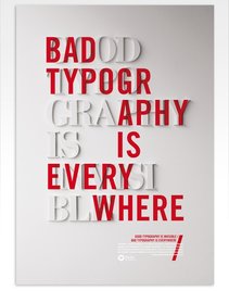
TYPOGRAPHY 
Traditionally defined as the art of process of setting, arranging, and designing type.
It is the glue that holds a design together, control emotions, tells stories not just with words but with design and style of the type.

Picture
IT IS INFLUENCED BY technological advances and culture
​(political, social, academic, artistic, etc).
  • Type evolved from one-of-a-kind handwritten scripts to printed technologies - this changed the nature of written communication so much that the term "typography" was coined to describe it.
  • Current digital typographic innovations continue to push the boundaries of type use in design.
  • Typographic quality is based on reproducibility.

TIMELINE OF KEY EVENTS

Pre-700 CE

Type has evolved from one-of-a-kind handwritten scripts to printed technologies; its evolution is influenced by technological advances and culture (political, social, academic, artistic, etc). Looking far back in our history beginning as early as 38,000 BCE we can see the start of visual communicative markings in caves, on stone tablets, on papyrus and papers, through digital means.
Picture
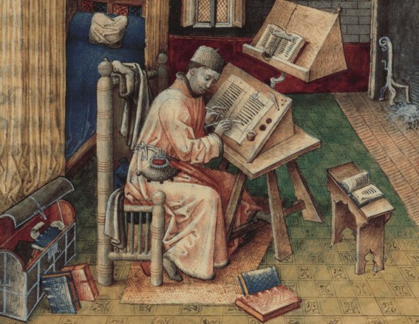
Book scribe creating a copy of a book.
In the beginning scribes would make manual copies of original texts. This process of reproduction was very time intensive and errors could occur.

Woodblock printing techniques, were developed around 700 CE. by the Chinese which sped up the process of reproducing works; the first printed book was a  Buddhist text called the Diamond Sutra published by Wang Jie  in 868 CE. ​

Early movable type began around 1040 CE (Song Dynasty) porcelain-like movable type had been used by Bi Sheng. Two-hundred years later during the Goryeo Dynasty in Korea that the first metal moveable type printing system was developed. This led to the Jikji, the earliest known movable metal type printed book in 1377. Neither of these caught on because of the enormous amount of labor involved in producing the letterforms - block printing remained the primary production method.
​For this class we are going to jump far ahead...

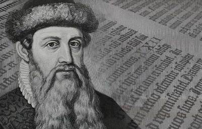
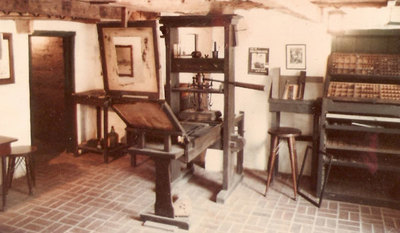
1440s - Johannes Gutenberg, German

  • Started the printing revolution in Europe.
  • Credited with the invention of mechanical, movable type made from metal and the printing press - see a press in action; short version. 
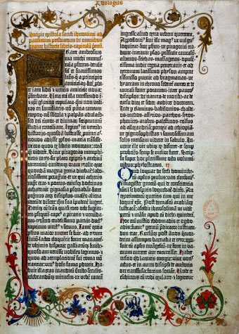
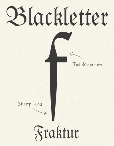
  • ​Created the first typeface - Blackletter (Fraktur) which was dark, fairly practical and intense but not very legible.
  • Movable type is a relief printing technique that lowered the cost of reproducing print, made printed materials more available to the masses.
  • His 42-line Bible became the first book printed in Europe using movable type technology.
  • ​Johannes Gutenberg and the Printing Press |  video

1470 - Nicolas Jenson, French

Picture
Picture
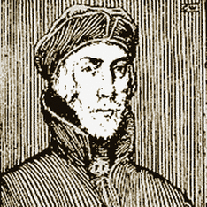
Nicolas Jenson
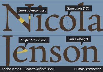
  • Created Roman Type which was inspired by the text on ancient Roman buildings; based on straight lines and regular curves.
  • More readable than Blackletter.
  • Important figure in the early history of printing and a pivotal force in the emergence of Venice as one of the first great centers of the printing press.

1501 - Aldus Manutius, Italian

Picture
Picture
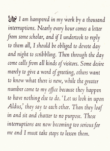
Narrow, Bembo, Italics sample.
  • Italian humanist who became a printer and publisher when he founded the Aldine Press at Venice.​
  • Created italics and designed many fonts; italics was originally created to fit more words per page and save money on printing.
  • He possessed a passion for learning,  founded the Aldine Academy of Hellenic Scholars. invented the concept of pocket / portable books.

SERIF

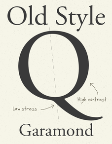
Old Style

  • Old Style were created between the late 15th century and mid 18th century. 
  • Strokes: Low contrast between thick and thin
  • Serifs: Thick bracketed
  • Body: small body spaces
  • Ascenders and descenders: Long
  • Examples: Caslon, Sabon, Bembo, and Garamond

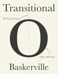
Transitional

  • Transitional is a stylistic bridge between Old Style and Modern; Occurred in mid 18th century due to advances in printing technology
  • Strokes: Higher contrast between thick and thin
  • Serifs: Sharper, flatter
  • Curves are tighter and bracketed and the stress in the curved letters is more vertical
  • Examples: Baskerville, Bell, Bulmer, Georgia

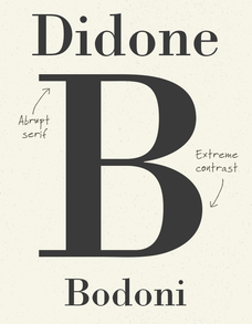
Modern

  • First appeared in the late 18th century
  • Strokes: Extreme contrast between thick and thin
  • Serifs: Ultra thin un-bracketed serifs, horizontal or nearly horizontal
  • Examples: Bodoni, Didot, Modern No. 20, and New Caledonia

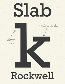
Slab

  • Mid 18th century emergence
  • 2nd Industrial Revolution - advertising created a need for new type.
  • Their weight and presences made them useful in advertising and signage
  • Strokes: Lack of contrast in the
  • Serifs: are  generally un-bracketed or square
  • ​Examples: Rockwell, Memphis, Serifa, Vitesse
Picture

1734, William Caslon
​(English)

  • 1734, William Caslon (English) create Garamond; it has straighter serifs and more obvious contrast between thin and bold strokes.
  •  With his father, they produced the first English book of type specimens.
Picture

1757, John Baskerville (English)

  • Created Bakerville a Transitional Type; it is a Roman style type with very sharp serifs and a great deal of contrast between thick and thin lines.
Picture

​1780, Didot (French) and Bodoni (Italian)

  • Created the first ‘modern’ Roman typefaces - Bodoni:​ The contrast is more extreme than before creating a cool, fresh look.​
Picture

1815, Vincent Figgins (British)

  • Created Rockwell an Egyptian, or Slab Serif – the first time a typeface had serifs that were squares or boxes.​​

SANS SERIF

Grotesque or Gothic

  • Stroke width: slight variations
  • Letters: fairly wide and rounded letters are a bit squared off.
  • Examples: News Gothic, Helvetica, Univers, Verdana

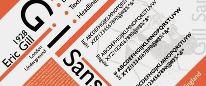
Humanist

  • Have the proportions of classical Roman letters
  • Examples: Gills Sans, Myriad, Optima, Frutiger

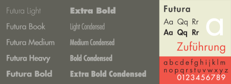
Geometric

  • Based on the geometric forms of the circle, square, and triangle
  • Reflect the modernist movement of the early 20th century
  • Examples: Futura, Kabel, Century Gothic, and Avant Garde
Picture

1816 - William Caslon IV, English

  • Designer of the first Sans Serif typeface: type without any serifs at all. 
  • It was widely rebuked at the time. 
  • During this time, type exploded, and many, many variations were being created to accommodate advertising.
Picture

1920s
Paul Renner, German

  • Created Futura, geometric sans.
  • Avoided any non-essential elements, making use of basic geometric proportions with no serifs or frills.
  • Futura's crisp, clean forms reflect the appearance of efficiency and forwardness even today.
Picture

1920s
Eric Gill, English

  • Created Gill Sans, Humanist Sans.
  • Based off of geometric sans but with gentler, more natural curves.
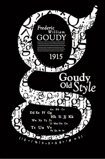
Picture

1920s
​Frederic Goudy
​American

  • The world’s first full time type designer, developing numerous groundbreaking typefaces, such as Copperplate Gothic, Kennerly, and Goudy Old Style.
Picture

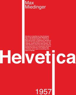
1957
​Max Miedinger
​Swiss

  • Created Helvetica, the most well-known typeface of our time.
  • This was a return to minimalism, and many other simplistic typefaces such as Futura surfaced around this time period.
  • Filmmaker Gary Hustwit explores the proliferation of the typeface and how it affects our lives in his movie entitled Helvetica; see the trailer on YouTube.

OTHER

Script
​Type

  • Derived from 17th century formal writing styles.
  • Many characters have strokes that join them to other letters.
  • Examples: Bickham Script, Elegy, Helinda Rook, Young Baroque

Calligraphic Scripts 

  • These scripts mimic calligraphic writing.
  • Both connecting or non-connecting in design.
  • Many appear to have been written with a flat-tipped writing instrument.
  • Examples: Belltrap, Blaze, Mistral, Vivaldi

Blackletter & Lombardic 

  • Patterned on manuscript lettering prior to the invention of movable type.
  • Examples: Agincourt, Cresci Rotunda, Coudy Text, Monmouth

Casual
Scripts

  • Designed to suggest informality
  • Looks written quickly
  • Appear to be drawn with a brush.
  • Character strokes can connect one letter to the next
  • Brush Script, Freestyle Script, Limehouse Script, Nadine

Decorative Type

  • Largest and most diverse category
  • Rarely used for lengthy blocks of text
  • Popular for signage or headlines
  • They frequently reflect an aspect of culture – tattoos or graffiti – or evoke a particular state of mind, time period or theme
  • Can also appear 3D
  • Examples: ITC Aftershock, ITC Airstream, Mo Funky Fresh, WacWakOoops!

Present Day

Enter the computer age where the possibilities are endless!
Picture

Pixel

  • Started with pixel type due to the primitive monitors
  • Quickly evolved ---->
Picture

Adobe

  • Invents Postscript in 1985
  • Uses mathematical calculations to describe type rather than pixels.
  • Apple create a PostScript controller for the Apple LaserWriter. This printer was similar to the HP LaserJet but the PostScript controller would allow it to output ‘typesetter quality’ pages.
Picture

Apple & Microsoft

  • Jointly develop Truetype in 1989
  • Not as clean and reliable as postscript but allowed for font design to explode!
Picture

Adobe & Microsoft

  • OpenType font file developed jointly by Adobe and Microsoft in the late 1990's.
  • Cross-platform compatible and supports widely expanded character sets and layout features.

Resources

  • Type Classifications | Fonts.com
  • Anatomy of Type | Vismeo.com
  • 25 mind-blowing typography art projects | 99 Designs
presentation-notes.docx
File Size: 173 kb
File Type: docx
Download File

Educator | Visually Clear Studio